By: Anthony T. Pittari
Motion Graphics Designer
Big Black Bear Dog Productions, Inc.
This technique is alittle more complex than the Paper Background but its worth it. We¹ll be using the same techniques as above but we will integrate it with layer blending, color shifting and a few cool filters to bang out an image.
1) Create a new blank document (1600×1200@72/RGB/White BG)
2) Make sure the the colors are (black/white)
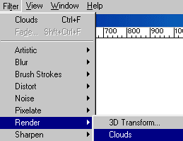
3) Filter->Render->Clouds
Keep doing it until you like what you see. If you would like more contrast hold the Option key when selecting the filter.
4) Add a Noise Layer Filter->Noise->Add Noise…
This is totally subjective but here are my settings:
Amount – 32
Distribution – Gaussian
Monochromatic – Checked
Then Filter->Blur->Blur More

5) Double Click on the Background Layer in the Layers Palette and hit OK. It will now be named Layer 0.
6) Drag Layer 0 to the New Layer Icon at the bottom of the Layers Palette to duplicate the layer. Watch that trash can 🙂
7) Select Layer 0 Copy in the Layers Palette.
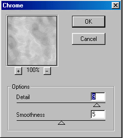
8) Filter->Sketch->Chrome… (Detail 9, Smoothness 5) Chrome is an excellent filter for creating complex blending layers. Low Detail values will space out the swirling effect and high Detail settings will tighten the swirls and make more complex patterns. I like to use mid/high level detail settings and use the smoothness factor to adjust it. this filter is awesome for adding dimension to an image. open any image, dupe the layer and run chrome on it, then use overlay mode. instant plasticwrap. using hard light mode yields a watery effect. very cool. ok back to what we were doing.
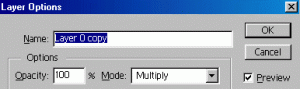
9) Double Click Layer 0 Copy and Change it to Multiply Mode in the Layers Palette.
Cool, eh? Its a good start but we have more to do.
This is a good time to save your document and look it over. Is it too dark? Is it too sharp? Too complex? Sometimes when im working on a background, and I get to this stage, I’ll make a text layer or bring in an eps logo just to see what needs to be done to make the logo or text stand out on its own. pick something that works for you.
10) Drag Layer 0 to the New Layer Icon at the bottom of the Layers Palette to duplicate the layer again and move the copy to the top of the layer list.
11) Filter->Stylize->Glowing Edges… (Edge Width 4, Edge Brightness 10, Smoothness
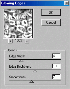
I love this filter. Perfect way to add strange and unique detail to your image. play with the settings until you are happy.
12) Set the new layer to Overlay Mode.
Pretty cool, but its lacking something. Let¹s mess with the color.
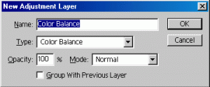
13) Layer->New->Adjustment Layer…Color Balance
I think Color Balance is one of the most useful tools in photoshop. It lets you tint an image based on its levels, atleast thats my interpretation of it. In the Color Balance dialog you have 3 sliders for adjusting color and 3 radio buttons that correspond to the shadows, midtones and hilights. By using varying shades of color in each of the levels you can easily set the mood of your image. do you want it to be dark and gloomy? How about metallic? Do you need a warm fuzzy image or a high-tech cold image? All of these things are easily doable just by playing with color.
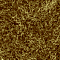
Let’s go for a golden metallic look. The key to making good looking gold is adding red to the shadows to warm up the background while adding generous amounts of yellow to hilight areas. The midtones will sway the mood depending on how much red, yellow, green or cyan you add. Adding more red and yellow will darken and warm up the image, adding cyan, blue or green will mute the goldish hue and give you more of a matte brass color.
Here are my settings for Shiny Gold and Muted Brass
Gold:
Shadows – +10, 0, -10
Midtones – +8, 0, -20
Hilights – -+5, 0, -50
Brass:
Shadows – -1, -5, -11
Midtones – +7, 0,-14
Hilights – -9, 0, -30
These settings look good on my monitor but you may have to adjust due to gamma differences on your setup. I’m using the SMPTE-C profile.
14) Blur both of your texture layers until you think its smooth enough to put type over. I guassian blurred both layers with a setting of 2-3.5
Make sure you adjust your color balance settings to reflect the changes of luminosity values during blurring, you may need to tweak the midtones if you applied alot of blur.
Now thats a weird looking background, but it sure is unique. i’m gonna leave the final touches up to you, but here are a few hints to get you started.
Layers containing gradients can be used to direct attention to certain parts of your image. If you have some large text that is going to fly in from the center, make a gradient on a separate layer and use blending modes to adjust. a white-black-white gradient used with multiply mode will darken center areas, inverting that gradient and using it with screen, overlay or soft light modes will brighten up the center for dark text or colored logos.
Duping a layer and trying different blending modes is a great way to see how certain patterns will affect your overall design.
If you arent sure what a certain operation is going to do to one of your layers, dupe the layer before you do the operation. You can always delete the bad one, but if your history settings arent correct for the way you work or you are on someone elses machine, you can work without it.
Try bringing the .PSD file into AE as a comp. Sometimes animating the position or scale of a layer will knock your socks off.
The main thing to remember is that your content is the most important element. Making your content stand out should be a primary goal when designing a background.
I hope you found this useful.
Tony
— Anthony T. Pittari is a freelance Graphic Designer in Princeton, NJ. He Specializes in Photoshop, Illustrator and After Effects. Some of his most notable clients have included: A&E Biography, QVC, Johnson & Johnson HealthCare Systems, Merrill Lynch, ETS and Anton Bauer.